

![]()

Client
Spark is a newly established organization at St. Lawrence College in Kingston, Ontario. The organization is an agency style group of students that has come together to form an innovative, hybrid learning, production house. They complete highly creative projects that benefit students, professors, programs, and other services at the college. The projects are meant to establish a base of knowledge that is digitally accessible, innovative, and interactive.
Rationale
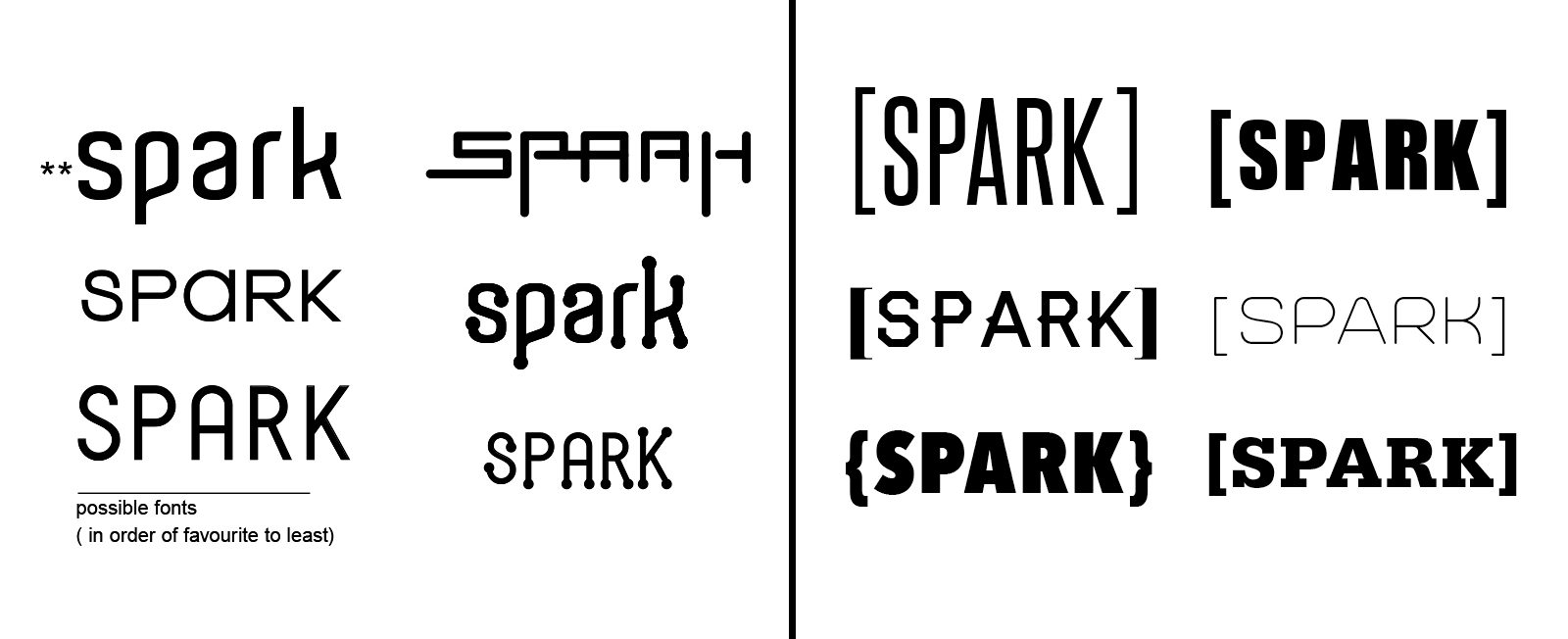
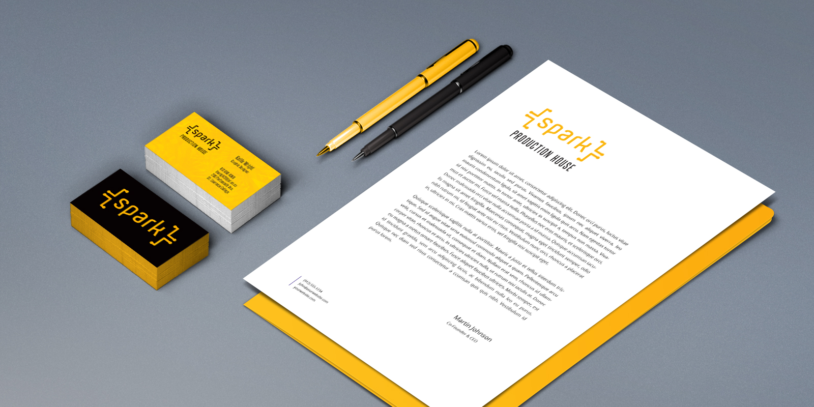
I had the benefit of being one of the two first Graphic Designers on the team, and was tasked with working with the other designer to establish the agency’s branding. As a team we came up with the name Spark, and created the symbol that is now Spark’s identity. The font was chosen for its unique appearance: the curvature in the typeface represents the non-linear thinking that goes into Spark’s projects. The brackets around the logo are a simplified form of a circuit board, symbolizing connectivity, current, energy, and the flow of information.
I was also the lead on the original website development: responsible for creating the user-experience of the site, organizing the team photoshoot, and compiling/organizing the original content on the website. * has since been modified