
Client
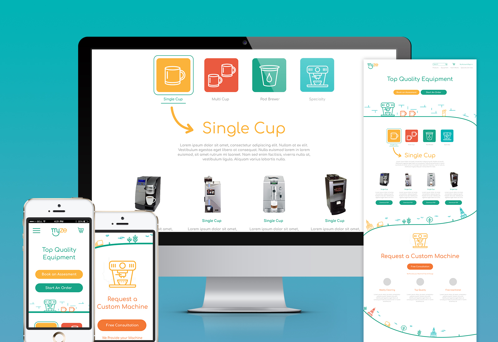
Myze provides coffee and grocery services to offices in the Toronto and GTA area. Their old brand Competition Coffee focuses only on the coffee services that are provided, and the client approached the agency to do a new website encompassing the grocery side of the service as well. We recommended a new brand and name that would also lend itself more to the services they provide before proceeding with a new website in order to ensure that the brand would be set apart from competitors offering the same services.
Project
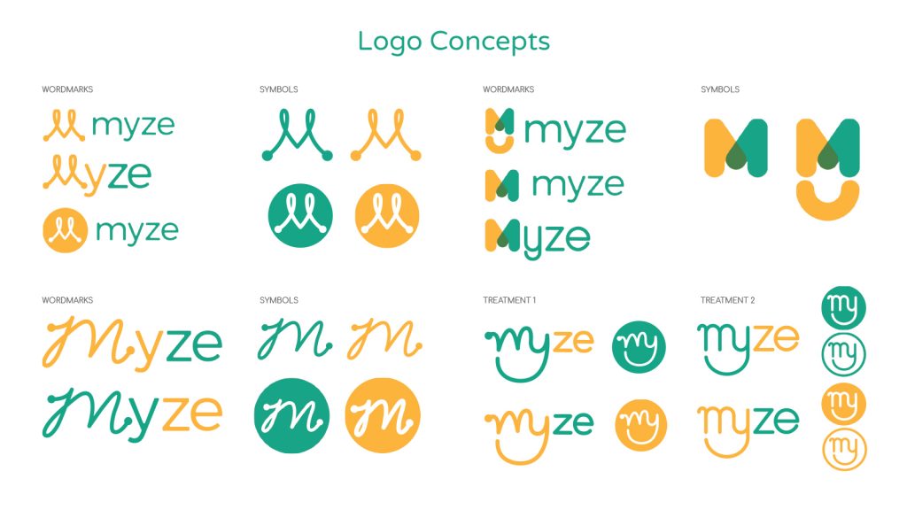
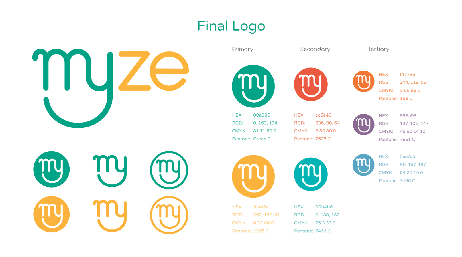
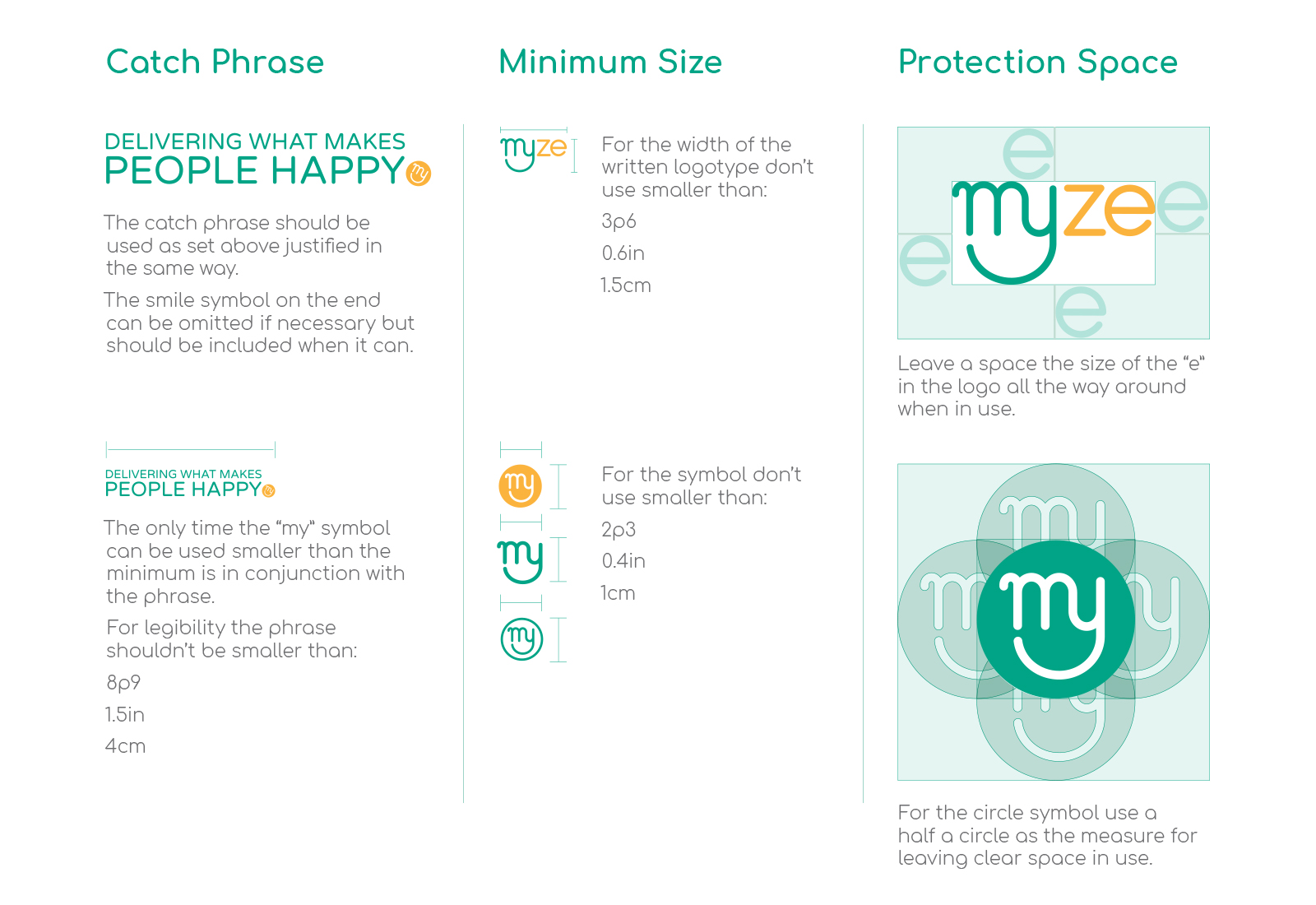
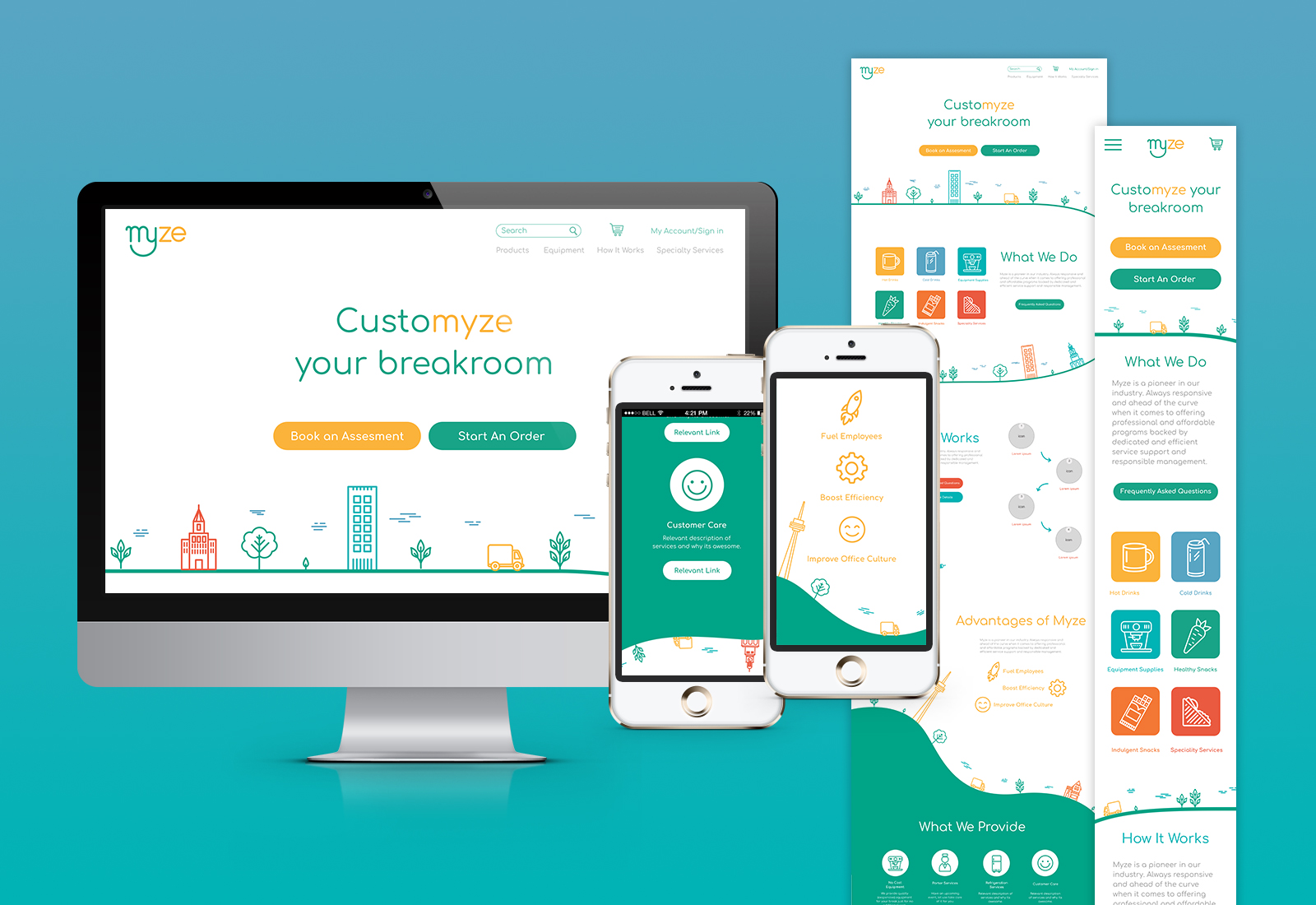
My role in the project was Art Director, so after the client agreed to the new name Myze, I ran a brainstorming session for the rebrand to determine options for concept and direction. We landed on moving our focus to a strong wordmark that emphasized the enjoyment and free time companies get from using this service. I chose green and yellow as the main brand colours. These complementary colours represent different aspects of the company. Green is associated with groceries and health, and represents the eco-friendly mindset of the company. Yellow is a warm inviting colour that is also appetizing. The symbol represents a smiling face to align with main brand messaging “delivering happiness”. This motif is shown throughout brand elements like illustration and colour to showcase happiness, flexibility, and a whimsical tone.
