
![]()
![]()
![]()


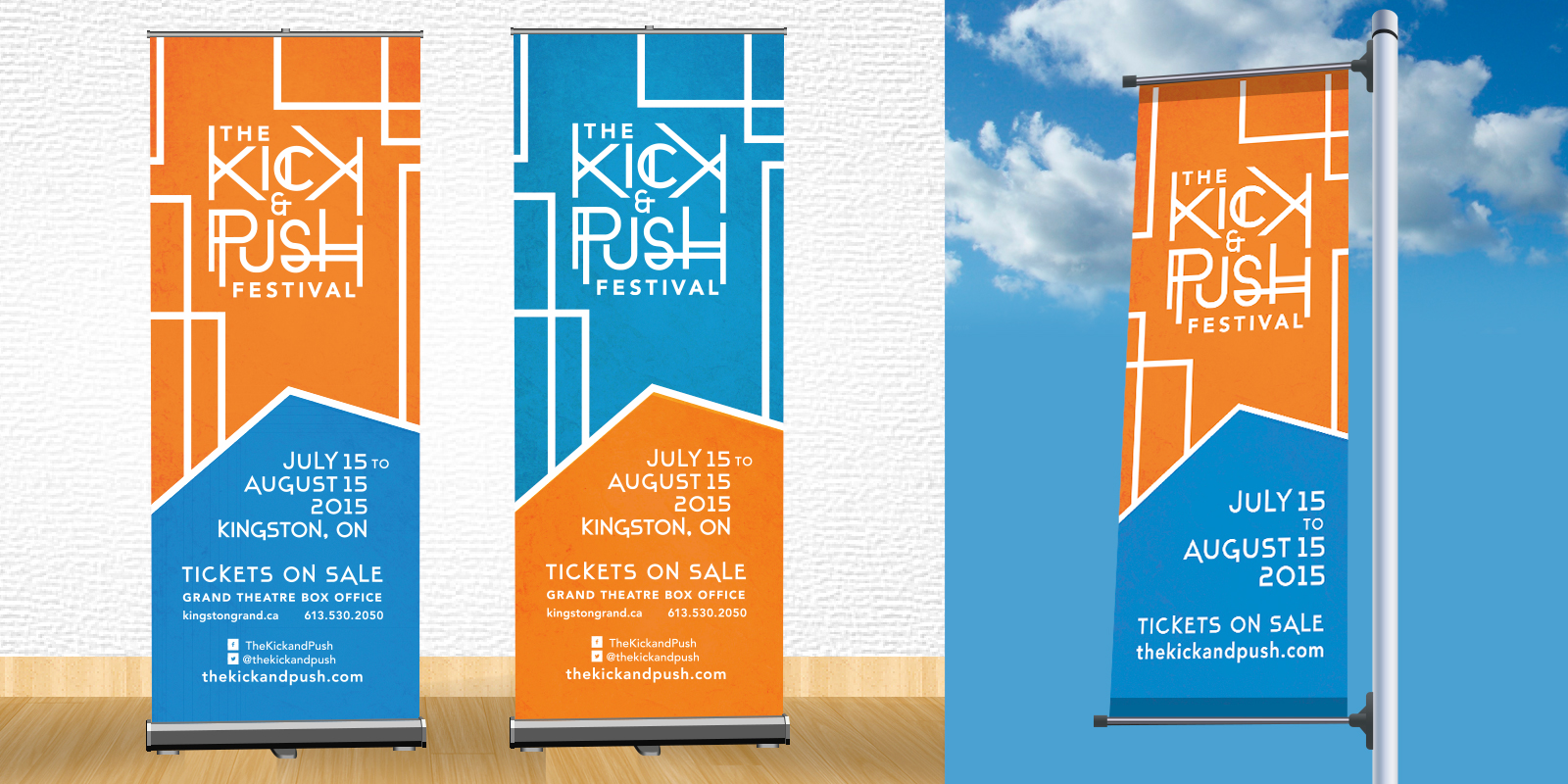
Client
The Kick & Push Festival kicked off it’s first ever events in July, 2015. The festival focuses on changing the outlook on traditional theatre and giving people something new to experience. All Kick & Push events involve interactive performances that require audience participation.
Rationale
For the Kick & Push branding I played with the idea of interactivity and intrigue. The lines of the logo are all aligned to connect with each other – the connection between the letters signify the desire of the K&P Festival to create connections between the audience and the performers. The fun and playful feel to the font is meant to display the character and nature of the events themselves. The logo is a custom designed font that was originally inspired by the railway tracks that the Kick & Push Festival is named after.